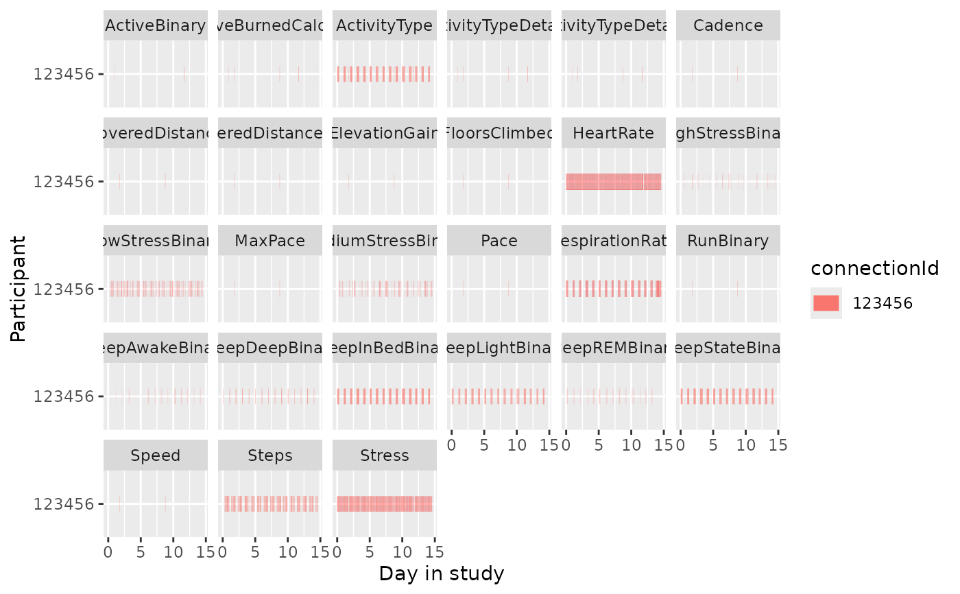
Creates a visualization showing the temporal coverage of wearable data across participants and variable types. This is useful for assessing data completeness and identifying gaps.
Usage
coverage_chart(
  .data,
  participant = "connectionId",
  start = "start_time",
  end = "end_time",
  variable = "variable",
  tz_offset = "tz_offset"
)
Arguments
- .data
A data frame containing the wearable data, typically from
clean_dynamic_data().- participant
The name of the column containing participant identifiers. Defaults to
"connectionId".- start
The name of the column containing start timestamps. Defaults to
"start_time".- end
The name of the column containing end timestamps. Defaults to
"end_time".- variable
The name of the column containing variable names. Defaults to
"variable".- tz_offset
The name of the column containing timezone offsets. Defaults to
"tz_offset".
Value
A ggplot2::ggplot object displaying data coverage as horizontal segments per participant, faceted by variable type.
See also
daily_coverage_chart() for daily-level coverage