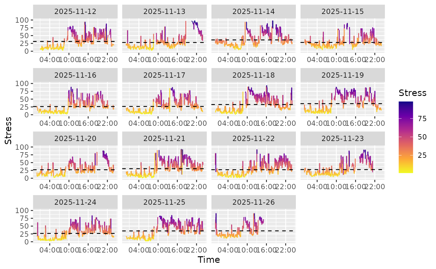
Creates a visualization of continuous stress level measurements over time from wearable data. Stress values are shown on a scale of 0 to 100.
Usage
stress_chart(
  .data,
  start = "start_time",
  end = "end_time",
  variable = "variable",
  value = "value",
  tz_offset = "tz_offset",
  add_average = TRUE
)
Arguments
- .data
A data frame containing the wearable data.
- start
The name of the column containing start timestamps. Defaults to
"start_time".- end
The name of the column containing end timestamps. Defaults to
"end_time".- variable
The name of the column containing variable names. Defaults to
"variable".- value
The name of the column containing measurement values. Defaults to
"value".- tz_offset
The name of the column containing timezone offsets. Defaults to
"tz_offset".- add_average
Logical. If
TRUE(default), adds a dashed horizontal line showing the daily average stress level.
Value
A ggplot2::ggplot object displaying stress levels faceted by date.
See also
stress_chart_discrete() for discrete stress states