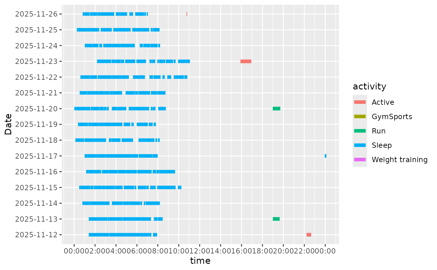
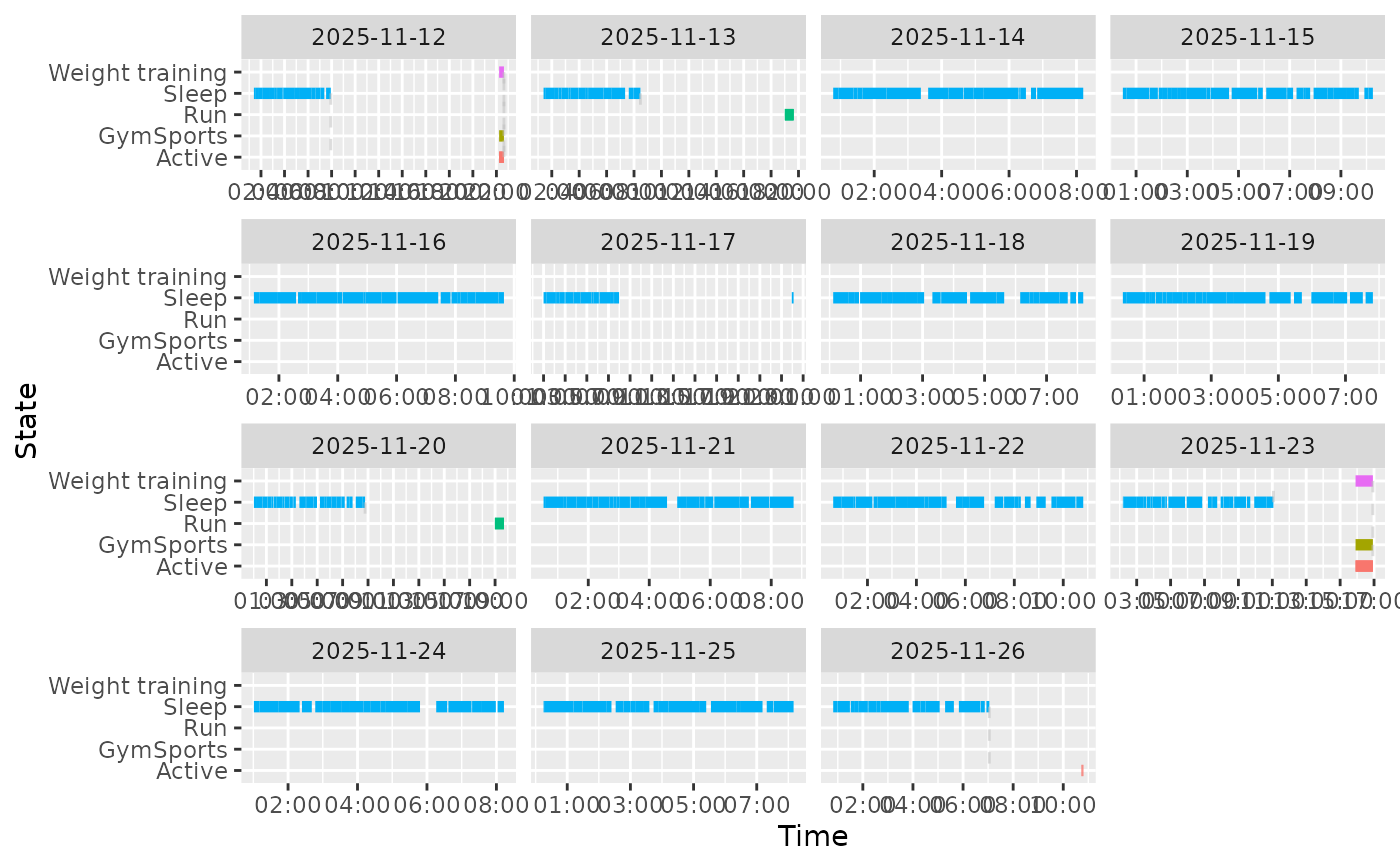
Creates a visualization of activity types over time from wearable data. The chart can display activities either as merged horizontal bars per day or as individual activity segments with transitions.
Usage
activity_chart(
  .data,
  start = "start_time",
  end = "end_time",
  variable = "variable",
  value = "value",
  tz_offset = "tz_offset",
  merged_bars = TRUE
)
Arguments
- .data
A data frame containing the wearable data.
- start
The name of the column containing start timestamps. Defaults to
"start_time".- end
The name of the column containing end timestamps. Defaults to
"end_time".- variable
The name of the column containing variable names. Defaults to
"variable".- value
The name of the column containing measurement values. Defaults to
"value".- tz_offset
The name of the column containing timezone offsets. Defaults to
"tz_offset".- merged_bars
Logical. If
TRUE(default), activities are shown as a single row per day. IfFALSE, activities are shown with vertical transitions between states.
Value
A ggplot2::ggplot object displaying activity types over time.
See also
activity_intensity_chart() for activity intensity levels, steps_chart() for
step counts